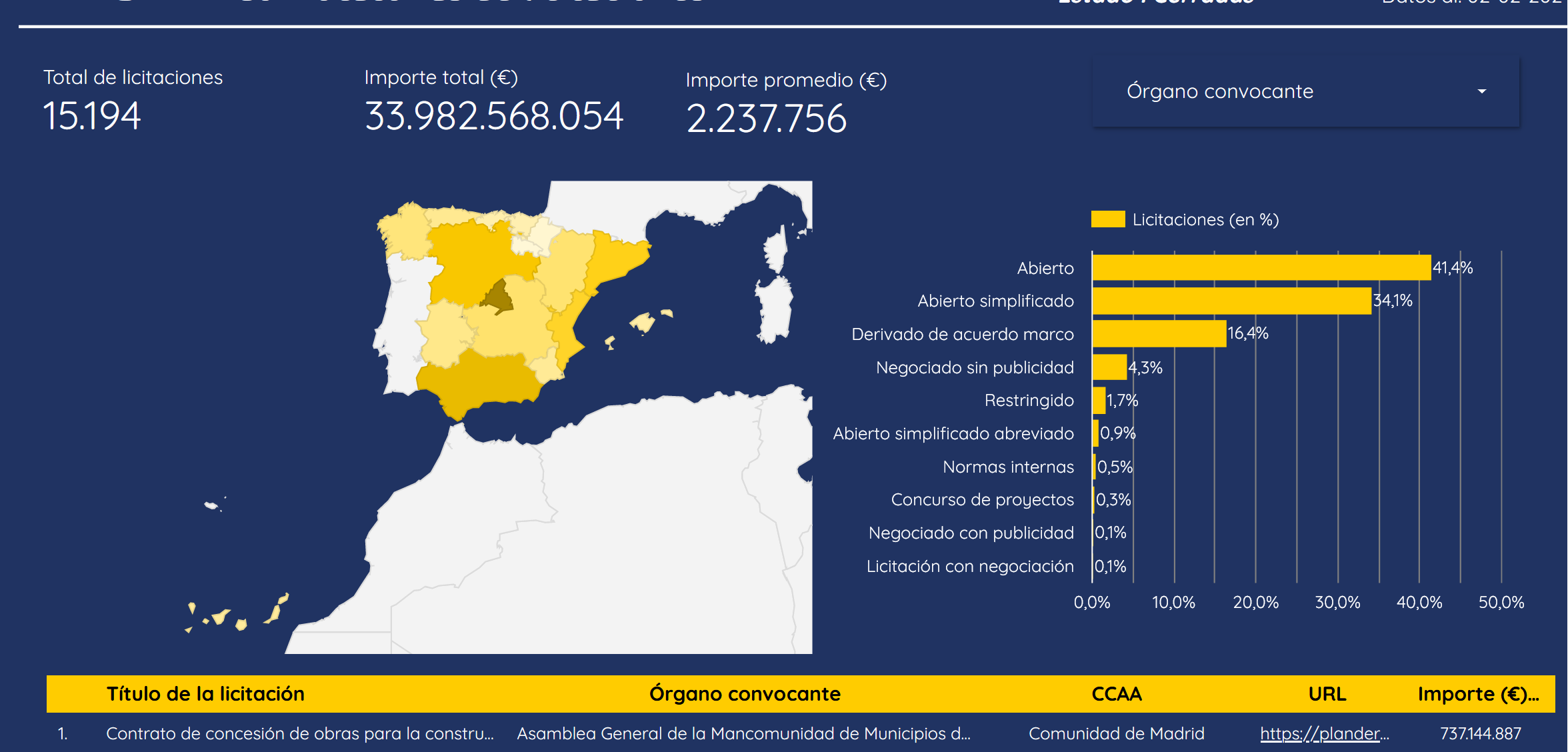
PRTR Data: Dashboard with aggregated data on EU-financed tenders in Spain
Written on April 21st , 2024 by Alvaro Carranza
At the beginning of this year I started working on two projects in parallel: SPPD (Spanish Public Procurement Database) and PRTR Data, a dashboard with aggregated data on EU-financed (Recovery and Resilience Facility) tenders in Spain. In both cases, I saw the need to have access to aggregated data but found the available options lackluster (until recently for the second one!), thus deciding to work on my own solution.
After a lot of work, I finished the first version of the dashboard (in Spanish for now) in February, but did not write about it at the time.
The dashboard aggregates data from the official website of the Spanish government. It is made on Looker Studio and connects to BigQuery to get all the data, extracted and transformed with Python scripts. The data pipeline is orchestrated with Airflow.
A couple of weeks ago, the Spanish government adressed this problem themselves and launched ELISA, a dashboard to visualize the very same data.
 ELISA dashboard (In Power BI!)
I am glad we are able to have an official option to do so and wanted to take advantage of this opportunity to quickly compare both dashboards and highlight their main strengths (and to what extent they are actually complementary).
ELISA:
- Has more accurate data (comes directly from the source!)
- Aggregates data in terms of main activity / sectors (not available in PRTR Data for now)
- Shows data on the evolution of the amount of tenders / closed tenders over time (not in PRTR Data either)
PRTR Data:
- Has visualization of open and soon-to-be open tenders (interesting for companies to monitor upcoming opportunities)
- Possibility to filter by institution responsible of the tenders for a more detailed scope
- In any of the filter options, the links to the top 10 tenders (ordered by amount) is directly available on the dashboard.
There are many other differences between both dashboards and I hope to be able to update PRTR Data in the future to match some of the features available in ELISA.
Even though this data was publicly available to everyone previously, how we are able to visualize is crucial so it can be useful / beneficial to different stakeholders (citizens, companies, public institutions…).
If you have any suggestions or comments about it don’t hesitate to reach out to me!

